
Samsung Galaxy S23 "Explore the New"
Studio Werk• Date added
• Date added
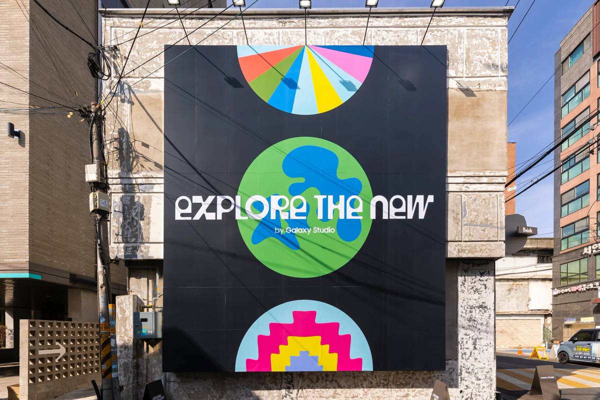
The Galaxy S23 is Samsung's 2023 flagship of the Galaxy S Series smartphone release.
Seoul-based graphic design practice, Studio Werk, led by Jaehoon Choi, created a graphic identity for Samsung's latest flagship devices launch event in South Korea.
Client
Cheil
Samsung Electronics
Year
2023
Art Director
Jaehoon Choi
Designer
Jaehoon Choi
Typefaces in Use
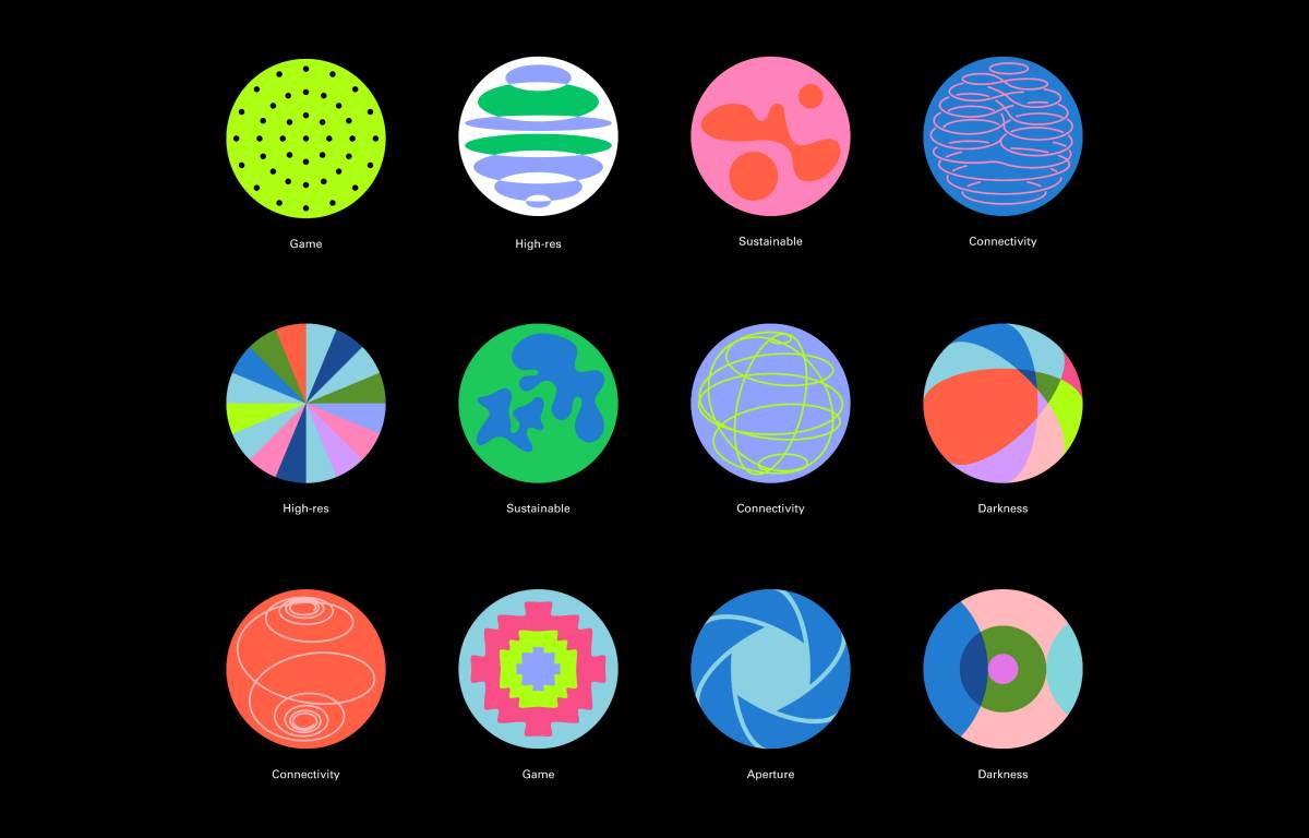
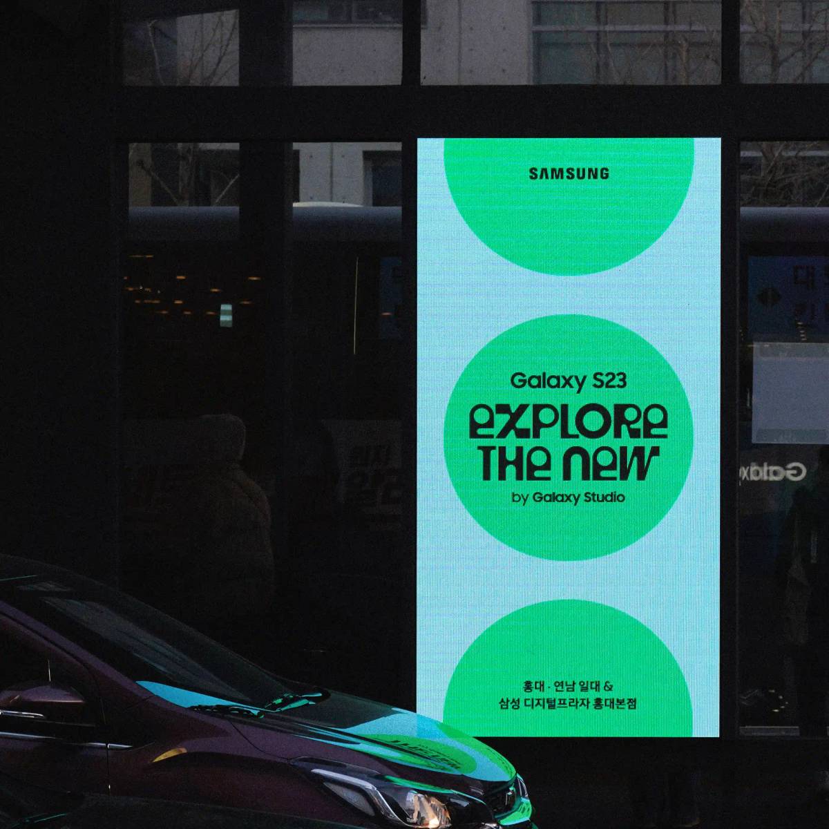
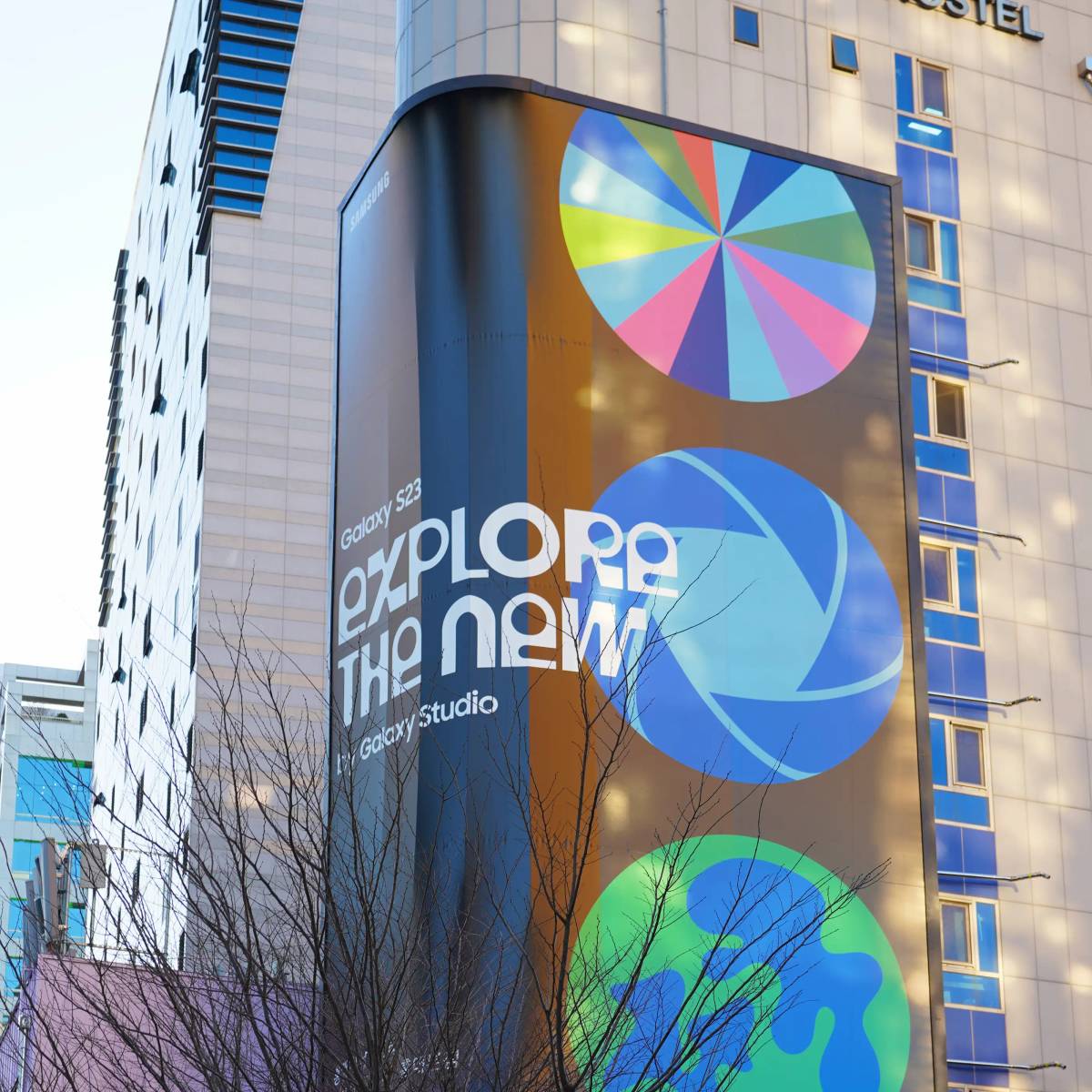
Studio Werk focused on constructing a graphic identity that metaphorically depicts the phone's camera's design without directly unveiling the product. By leveraging the camera design of the Galaxy S23, characterised by three consecutive circles, the studio developed a range of graphic variations that symbolise the device's five key aspects: connectivity, high-resolution capabilities, sustainability, gaming prowess, and refined camera capabilities in low-light environments.

Considering the Galaxy S23's triple camera lens as a prominent graphic motif, Studio Werk conducted a variety of explorations to determine the ideal graphic to be placed within the circle. These explorations involved placing drawings inside the circle, dividing it, and incorporating patterns. This process established a conceptual direction, centring around the five product keywords: game, hi-res, sustainability, connectivity, and darkness. Each keyword served as a foundation to develop a metaphorical representation.
To capture the essence of "connectivity," Studio Werk sought inspiration from the logical characteristics of geometric structures, such as spirals and Mobius strips. For the concept of "sustainability," organic shapes were derived from haphazard random drawings and the artistic works of Hans Arp. When portraying "hi-res," the studio aimed to convey the power of high-tech imagery using stacked lenses and colour prisms.
Visual elements were strategically used for the remaining metaphors to establish subtle connections with the corresponding keywords. This approach transformed the series of circles into a symbolic code, inviting viewers to interpret and delve deeper into their meaning.
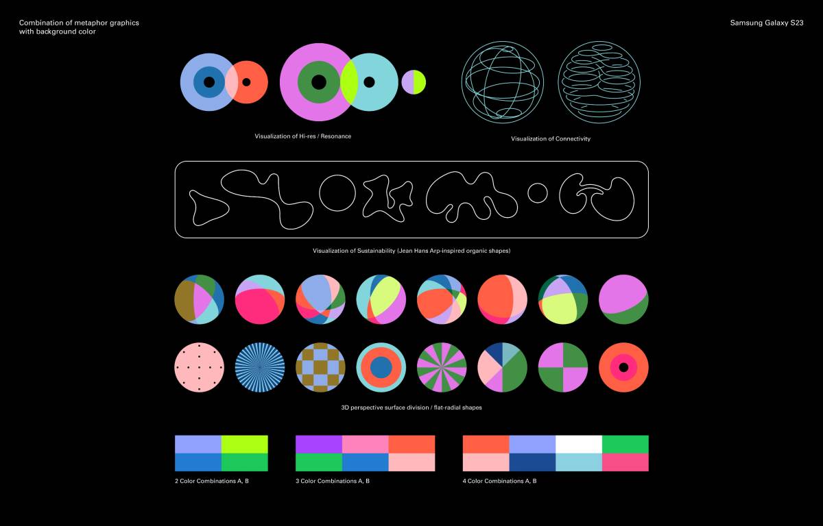
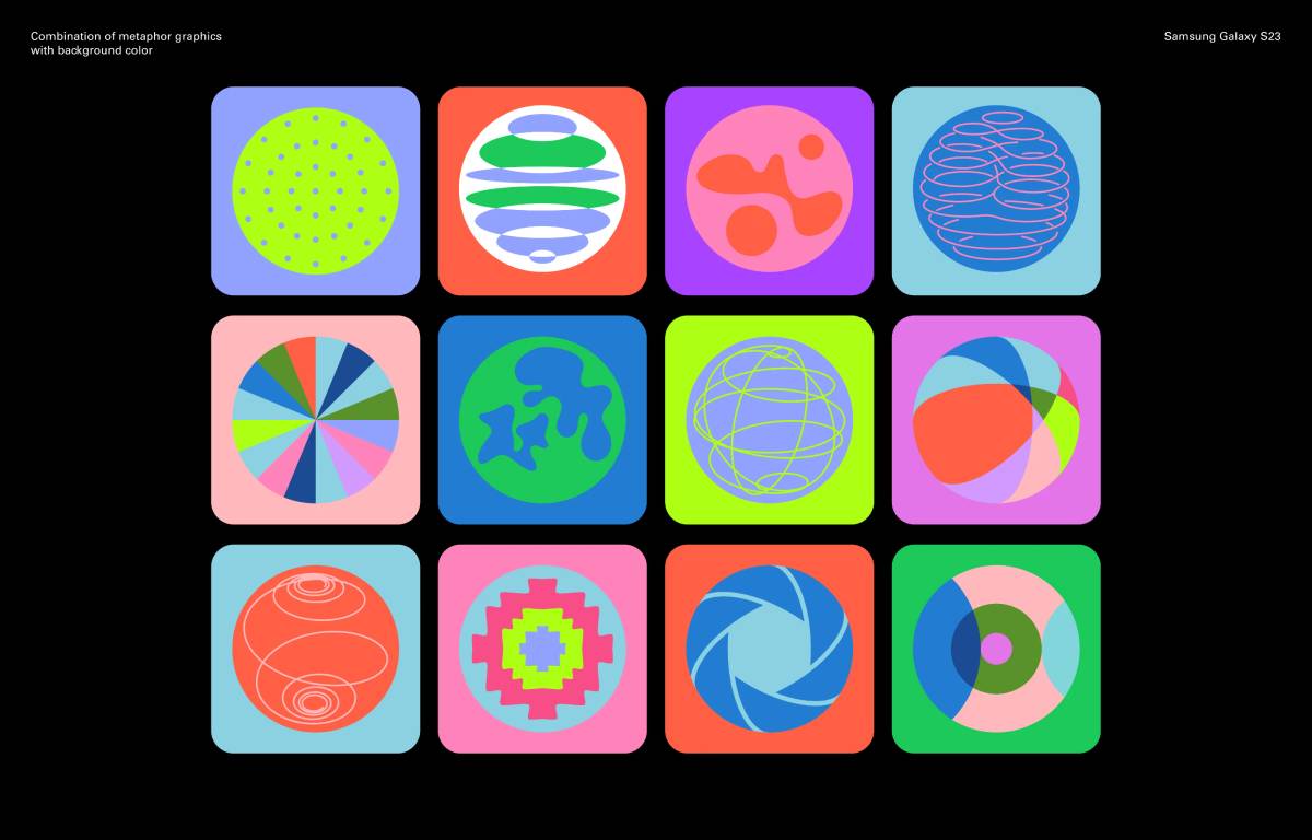
To capture the attention of a large audience within a limited timeframe, Studio Werk chose a vivid and eye-catching colour combination. The focus was on creating complementary yet contrasting combinations, ensuring that each colour stood out distinctly. The studio meticulously assessed each colour's saturation and brightness balance, using physical colour chips to visualise their appearance in an exterior installation accurately. The most important were the vibrant and colourful hues that maintained a sophisticated appeal without appearing overly childish. The chosen colours were combined thoughtfully to ensure a cohesive look when using the three circles as a set.
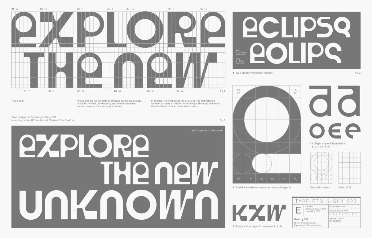
Studio Werk crafted the overall lettering structure for the main slogan, "Explore the New," drawing inspiration from the product's consecutive camera circles that served as the key graphic element. The circular curves of the Roman alphabet were emphasised to create a distinct "unicase" style that exudes a sense of uniqueness and character. The variation in the size of each circle within the letters produced a visually harmonious composition.

Studio Werk
Based in Seoul, Studio Werk is a graphic design practice specialising in identity design and digital and printed materials for brands, institutions, and businesses since 2019. The practice was founded by Jaehoon Choi and delves into the exploration of standardised objects and symbolised schematic images, based on his interests in typological subject matter and industrial objects.
Related works


